All writing
Web Development7 min read
Exploring the New Features of Storybook 10
Discover the enhancements in Storybook 10, focusing on performance, testing capabilities, and developer experience.

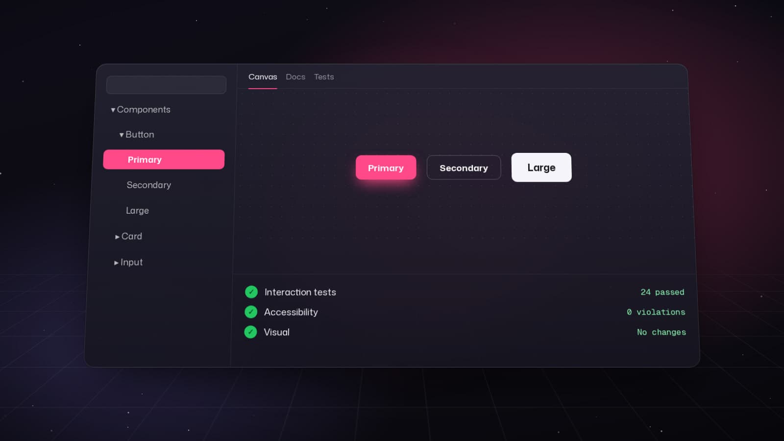
Storybook 10, released in November 2025, represents a major evolution in component development tooling. With module automocking, typesafe story creation, and enhanced mobile testing capabilities, this release focuses on developer experience without breaking your existing workflows.
ESM-Only Architecture: Faster and Leaner
Storybook 10's most significant change is its ESM-only architecture. This is the only breaking change in the release, but it brings substantial benefits:
- 29% reduction in install size (on top of the 50% savings in v9)
- Faster startup times across all frameworks
- Modern build pipeline with better tree-shaking
Requirements: Node.js 20.16+, 22.19+, or 24+ with ESM support.
# Install Storybook 10 in a new project
npm create storybook@latest

# Upgrade existing project
npx storybook@latest upgrade
Module Automocking: Simplify Component Testing
Developed in collaboration with Vitest, module automocking automatically mocks dependencies, making it easier to isolate and test components.
Enable automocking in your .storybook/preview.ts:
import { automock } from '@storybook/test';

export default {
  beforeEach: automock({
    include: ['**/services/**', '**/utils/**'],
    exclude: ['**/constants.ts']
  })
};
Use mocks in your stories:
import type { Meta, StoryObj } from '@storybook/react';
import { fn, mocked } from '@storybook/test';
import { UserProfile } from './UserProfile';
import { fetchUser } from '@/services/api';

const meta: Meta<typeof UserProfile> = {
  component: UserProfile,
  title: 'Components/UserProfile',
};

export default meta;
type Story = StoryObj<typeof UserProfile>;

export const Default: Story = {
  async beforeEach() {
    // Mock the API call
    mocked(fetchUser).mockResolvedValue({
      id: '1',
      name: 'John Doe',
      email: 'john@example.com',
      avatar: 'https://i.pravatar.cc/150?img=1'
    });
  },
  args: {
    userId: '1'
  }
};
Typesafe CSF Factories for React
Storybook 10 introduces typesafe Component Story Format (CSF) factories, currently in preview for React. This feature ensures type safety when creating reusable story templates.
import { createStoryFactory } from '@storybook/react';
import { Button } from './Button';

const meta = {
  component: Button,
  title: 'UI/Button',
};

export default meta;

// Create a typesafe story factory
const createStory = createStoryFactory(meta);

// All stories inherit full type safety
export const Primary = createStory({
  args: {
    variant: 'primary',
    children: 'Click me',
  },
});

export const Secondary = createStory({
  args: {
    variant: 'secondary',
    children: 'Cancel',
  },
});

// TypeScript will error if you use invalid props
export const Invalid = createStory({
  args: {
    // @ts-expect-error - 'invalid' is not a valid variant
    variant: 'invalid',
    children: 'Error',
  },
});
Svelte Async Components Support
Storybook 10 adds first-class support for Svelte 5's async components, along with app state mocking capabilities.
// AsyncUser.svelte
<script lang="ts">
  import { getUser } from '$lib/api';

  interface Props {
    userId: string;
  }

  let { userId }: Props = $props();
  let user = $derived.by(async () => await getUser(userId));
</script>

{#await user}
  <p>Loading user...</p>
{:then data}
  <h2>{data.name}</h2>
  <p>{data.email}</p>
{:catch error}
  <p>Error: {error.message}</p>
{/await}
Story with mocked async data:
import type { Meta, StoryObj } from '@storybook/svelte';
import { mocked } from '@storybook/test';
import AsyncUser from './AsyncUser.svelte';
import { getUser } from '$lib/api';

const meta: Meta<typeof AsyncUser> = {
  component: AsyncUser,
  title: 'Components/AsyncUser',
};

export default meta;
type Story = StoryObj<typeof meta>;

export const Success: Story = {
  async beforeEach() {
    mocked(getUser).mockResolvedValue({
      name: 'Jane Smith',
      email: 'jane@example.com'
    });
  },
  args: {
    userId: '123'
  }
};
Enhanced UI: QR Codes and Editor Integration
Storybook 10 improves the developer experience with two notable UI enhancements:
- QR Code Sharing: The sharing menu now generates QR codes for instant mobile device testing. Scan the code to view components on your phone with one tap.
- Editor Shortcuts: Click a story's 'Edit' button to jump directly to the source code in your configured editor (VS Code, WebStorm, etc.).
Advanced Tag Filtering
Tag filtering has been enhanced with exclusion and configuration capabilities. You can now hide stories based on tags to declutter the sidebar.
// .storybook/preview.ts
export default {
  tags: {
    // Exclude experimental stories from the sidebar
    exclude: ['experimental'],

    // Or create custom tag configurations
    autodocs: ['dev-only', 'public-api']
  }
};
Tag stories for organization:
import type { Meta, StoryObj } from '@storybook/react';
import { NewFeature } from './NewFeature';

const meta: Meta<typeof NewFeature> = {
  component: NewFeature,
  tags: ['experimental', 'beta'],
};

export default meta;
type Story = StoryObj<typeof NewFeature>;

export const Preview: Story = {
  args: {
    enabled: true
  }
};
Next.js 16 and Vitest 4 Support
Storybook 10 adds day-one support for Next.js 16 and Vitest 4, while maintaining backward compatibility with older versions. This ensures you can upgrade your framework without waiting for Storybook compatibility.
// .storybook/main.ts for Next.js 16
import type { StorybookConfig } from '@storybook/nextjs';

const config: StorybookConfig = {
  framework: {
    name: '@storybook/nextjs',
    options: {
      // Next.js 16 features are automatically supported
      nextConfigPath: '../next.config.ts',
    },
  },
  stories: ['../app/**/*.stories.@(ts|tsx)'],
  addons: [
    '@storybook/addon-essentials',
    '@storybook/addon-interactions',
  ],
};

export default config;
Migration Guide from v9 to v10
The migration is straightforward since ESM-only is the only breaking change:
- Ensure Node.js version meets requirements (20.16+, 22.19+, or 24+)
- Run the automated upgrade command
npx storybook@latest upgrade- Update your
package.jsonto use ESM syntax if still using CommonJS
{
  "type": "module",
  "scripts": {
    "storybook": "storybook dev -p 6006",
    "build-storybook": "storybook build"
  }
}- Convert config files to ESM if needed
// Before (CommonJS)
module.exports = {
  stories: ['../src/**/*.stories.tsx'],
};

// After (ESM)
export default {
  stories: ['../src/**/*.stories.tsx'],
};
Performance Improvements
Beyond the install size reduction, Storybook 10 delivers performance gains across the board:
- 29% smaller install size
- Faster dev server startup
- Improved Hot Module Replacement (HMR)
- Optimized build output
Storybook 10 is a focused, performance-driven release that enhances developer experience without disrupting existing workflows. Whether you're building React, Svelte, or Next.js applications, the new module automocking, typesafe factories, and improved testing capabilities make component development faster and more reliable.
Keep reading
All writing
Web Development7 min read
Exploring the Benefits of shadcn/ui
Discover how shadcn/ui offers a new approach to component libraries, prioritizing developer control and customization.
Web Development5 min read
React 19.2: Transforming Application Development
Explore the powerful features introduced in React 19.2, including the Compiler, Activity Component, and useEffectEvent, which enhance performance and code quality.
Web Development8 min read
Exploring the New Features of Next.js 16
Discover the major improvements in Next.js 16 with Turbopack, async APIs, and PPR for faster web applications.